


Mastering the Art of Custom Label Design: A Professional Guide
Master the art of custom label design with this professional guide. Learn crucial considerations for creating effective industrial labels, including color selection for visibility and brand consistency. Understand typography principles for readability at various distances and lighting conditions. Discover how to optimize graphics for different printing technologies and material constraints. Get expert advice on information hierarchy, safety symbols, and regulatory compliance requirements. This comprehensive resource helps designers and engineers create functional, aesthetically pleasing labels that enhance user experience while meeting technical specifications and manufacturing requirements.
StikTec
11/15/20258 分钟阅读

Introduction to Custom Label Design
Custom label design plays a pivotal role in various industrial applications, serving as a vital touchpoint between products and consumers. Labels are not merely decorative elements; they convey essential information that enhances product usability, promotes brand identity, and ensures regulatory compliance. In an increasingly competitive marketplace, the significance of well-crafted labels cannot be overstated.
From packaging to product tags, custom labels are instrumental in communicating brand values and product attributes. They help differentiate a brand from its competitors by encapsulating its visual identity and message. A thoughtfully designed label can invoke emotional responses and foster brand loyalty among consumers, making it an indispensable aspect of marketing strategy. Furthermore, labels provide crucial information regarding usage instructions, ingredients, and safety warnings, which are essential for consumers’ informed decision-making.
In addition to boosting brand visibility, custom label design also plays a significant role in maintaining compliance with industry regulations. Depending on the sector, products may require specific labeling formats or information to adhere to safety standards and legal requirements. Therefore, understanding the regulatory landscape is a critical component in the design process. This ensures labels not only serve their marketing purpose but also safeguard businesses against potential legal issues.
This guide aims to provide an in-depth exploration of effective custom label design practices, offering insights into various elements that contribute to a successful label. By delving into design principles, material choices, and regulatory considerations, we prepare to uncover the complexities of creating labels that resonate with consumers while meeting industry standards. Ultimately, mastering the art of custom label design is essential for those looking to strengthen their brand presence in the marketplace.
Crucial Considerations for Effective Industrial Labels
When designing industrial labels, it is essential to begin by understanding your target audience. This involves identifying who will interact with the labels and what vital information they need to obtain quickly. For instance, if the labels are intended to communicate safety information, clear and concise language is crucial. The design should cater to the specific needs of workers in various sectors, such as manufacturing, logistics, and construction, where visibility and comprehension are critical for safety and efficiency.
The environment in which the labels will be used plays a significant role in shaping design choices. Industrial settings can be harsh, featuring exposure to elements such as moisture, chemicals, and extreme temperatures. Therefore, it is imperative to choose materials that offer durability and weather resistance. Industrial labels made from high-quality vinyl or polyester can withstand harsh conditions while maintaining their legibility and integrity over time. Additionally, selecting inks that are resistant to fading and smudging is essential, as readability is paramount in such demanding environments.
Another important consideration is the physical placement of labels. Proper positioning can enhance visibility and accessibility, facilitating quick reading and comprehension. For example, labels positioned at eye-level or on easily viewable surfaces ensure that critical information is not overlooked. Organizations should also evaluate the use of standardized label sizes and shapes to foster familiarity and ease of use among workers.
Incorporating these vital factors into the design process will lead to the creation of effective industrial labels that serve their intended purpose. By prioritizing the needs of the target audience, the environment of use, and practical placement, designers can enhance safety and efficiency within industrial operations.
Color Selection: Enhancing Visibility and Brand Consistency
Color selection is a fundamental aspect of label design that directly impacts visibility and communicates brand identity. Effective use of color can create immediate recognition, invoke emotional responses, and ensure that labels stand out in various retail environments. To achieve these goals, understanding the principles of color theory is crucial. Color theory encompasses the harmonious relationships between colors, including complementary, analogous, and triadic schemes, which can be utilized to create visually appealing labels.
When choosing color schemes for labels, it is essential to consider not only aesthetic appeal but also the psychological effects that colors can have on consumers. For instance, blue often evokes feelings of trust and security, making it a popular choice for brands in finance and healthcare. On the other hand, red can signal urgency and excitement, which may be effective for promotional labels targeting impulsive purchases. By conferring meaning through colors, brands can enhance their messaging and engage customers more effectively.
Visibility is another critical factor in color selection. Labels must be legible and easily discernible from a distance. High-contrast color combinations, such as dark text on a light background or bright hues against a neutral palette, can enhance readability. Additionally, it is advisable to consider how labels will appear under various lighting conditions. For example, fluorescent lighting can alter the perception of colors, making it vital to test label designs in environments that mimic actual retail settings.
Brands should also maintain consistency across their packaging to strengthen recognition. Consistent color usage helps reinforce brand identity while still allowing for creativity in label design. By selecting a defined color palette that resonates with the brand’s values and audience, businesses can create labels that are not only visually attractive but also effective in communicating their message while enhancing visibility and brand consistency.
Typography Principles for Readability
Effective typography plays a vital role in custom label design, serving as the bridge that conveys your message clearly and attractively. One of the primary considerations in typography is font selection. Choosing the right typeface is crucial, as different fonts evoke various emotions and connotations. Sans-serif fonts are often preferred for modern designs due to their clean lines and increased readability, especially at smaller sizes. Conversely, serif fonts can convey a sense of tradition and reliability, making them suitable for labels that emphasize heritage or craftsmanship.
Another essential element is font size. Ensuring your text size is appropriate for the label's intended viewing distance is key. For instance, larger sizes are necessary for labels viewed from afar, while smaller sizes can be read up close. A general rule of thumb is to use at least 10-12 points for print labels, adjusting as needed based on the viewing conditions.
Spacing, including leading (line spacing) and kerning (spacing between letters), also affects readability. Proper leading prevents text from appearing cluttered, while adequate kerning ensures individual letters do not blend together. As a result, maintaining sufficient space around text enhances the overall legibility of your label design.
Contrast is another critical factor to consider. A high contrast between text and background enhances readability; for instance, dark text on a light background is typically easier to read. However, designers should also be mindful of different lighting conditions, as glare can obscure text. Testing your labels under various lighting scenarios can help determine the best contrast combinations.
Ultimately, balancing aesthetic appeal with functional typography is essential for a successful custom label design. By applying these principles, designers can create labels that not only attract attention but also convey information effectively, fostering an enhanced user experience.
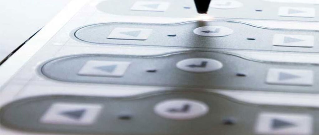
Optimizing Graphics for Printing Technologies
Optimizing graphics for printing technologies is a crucial step in ensuring that custom labels achieve the desired visual impact and meet quality standards. Each printing method—whether digital, flexographic, or screen printing—has unique requirements and constraints that must be understood and adhered to for the best results. Selecting the appropriate graphics and making the necessary adjustments can significantly enhance the print quality and longevity of the labels.
One of the primary factors to consider is the resolution of the graphics. For most printing methods, a resolution of 300 DPI (dots per inch) is typically recommended for sharp, clear images. Lower resolutions may suffice for larger prints and less detailed graphics; however, the risk of pixelation increases, potentially compromising the label's visual appeal. It is imperative to assess the final size of the label when determining the resolution of the graphics involved.
Color models also play a significant role in graphic optimization. For instance, digital printing often employs the RGB (red, green, blue) model during the design phase because it corresponds to the color output on screens. However, it is essential to convert the graphics to the CMYK (cyan, magenta, yellow, key/black) color model prior to printing since this model is standardized in the printing industry. Misalignment between these color models can result in colors on the printed labels appearing dull or inaccurate when compared to the original design.
Lastly, the choice of file formats affects the print quality. Common file formats for printing include TIFF, PSD, and PDF, as these preserve quality through layers and resolution. Ensuring compatibility with the specific printing technology chosen is essential for achieving optimal results. By attentively optimizing graphics based on these technical requirements, designers can create labels that not only look appealing but also function effectively within their intended application.
Creating Information Hierarchy and Using Safety Symbols
A crucial component of successful custom label design is establishing an effective information hierarchy. This hierarchy dictates the organization of text and graphical elements, ensuring that the most important information stands out. To create a clear visual hierarchy, designers should prioritize content by arranging text sizes, font weights, and colors in a way that guides the viewer's attention. Typically, the product name should be the most prominent, followed by essential details such as ingredients, usage instructions, and warnings. The implementation of contrasting colors can also enhance legibility, drawing the eye to key sections of the label.
Utilizing graphics is another essential strategy. Images or icons can efficiently convey information and emotions while supporting the accompanying text. For instance, an icon representing freshness or organic ingredients could visually express a product's key attributes without overwhelming the viewer. When employing graphics, it is important to select images that match the brand's identity and resonate with the target audience. Simplicity should be a priority; overly complex visuals can confuse rather than clarify the message.
Another vital element in label design is the incorporation of safety symbols and compliance elements, which can help communicate critical information quickly. Recognizable safety symbols not only inform users of hazards but also ensure universal understanding across diverse demographics. In particular, using standardized symbols compliant with regulatory guidelines is essential for products that may pose risks to consumers. Additionally, including certifications from recognized bodies can enhance credibility and consumer trust. By adhering to these best practices, label designers can create informative and visually appealing designs that effectively convey essential product information while complying with safety regulations.
Meeting Technical Specifications and Compliance Requirements
In the realm of custom label design, adhering to technical specifications and compliance requirements is crucial across various industries. Labels are not merely aesthetic elements; they serve vital functions that promote safety and compliance with legal standards. The nature of these requirements often varies by industry, necessitating a thorough understanding of specific regulations that govern labeling practices. For instance, the food and beverage industry is heavily regulated and requires labels to include pertinent nutritional information, allergen alerts, and expiration dates. Similarly, labels in pharmaceuticals must meet rigorous guidelines set forth by regulatory bodies such as the FDA, ensuring they accurately convey dosage instructions, usage warnings, and patient information.
Furthermore, sourcing materials that comply with these regulations is essential. The choice of label substrates, inks, and adhesives plays a significant role in both regulatory adherence and functional performance. Materials used must be durable enough to withstand environmental conditions such as moisture, temperature fluctuations, and exposure to chemicals. Additionally, eco-friendly materials are increasingly being favored in various sectors as part of a broader commitment to sustainable practices. Compliance requires manufacturers to not only integrate suitable materials but also maintain traceability throughout the supply chain.
Another important aspect is the label's ability to withstand specific environmental conditions. Labels must be designed with the understanding that they may encounter extreme temperatures, UV light exposure, or harsh cleaning agents. A label that deteriorates or becomes illegible under duress not only fails to communicate necessary information but could also pose significant safety risks. Effective custom label design, therefore, involves meticulous attention to these factors, ensuring that the final product not only meets aesthetic goals but also aligns strictly with compliance standards. This dual focus helps safeguard brand reputation and enhances overall consumer confidence in the products being offered.